Showing posts with label abstract art. Show all posts

Friday, April 22, 2016

Vacation Photos: Hoover Dam, Zion Park and Snow Canyon Park, Utah

Lake Mead

Powerhouse Floor design

Hoover Dam

Colorado River exiting Hoover Dam

Intake Tower
On the way out of Nevada towards southern Utah


Zion National Park/Virgin River


Snow Canyon State Park-Pinyon Trail


Rich and I have been on vacation this week so there is no new artwork. However, I thought I could share some of the photos that I took instead.

We visited Hoover Dam in Nevada and then drove on to southern Utah (St. George area) to hike at Zion National Park. I had read so much about the dam, the Colorado River and all things connected that I wanted to see those things in person. 

The first couple of shots show some highlights of the dam. I am very fearful of heights and so the image of the dam is taken from a distance out on the observation deck. Hoover Dam was constructed during the thirties and opened to the public in 1936. At the time, its construction was considered to be a modern marvel. It still is a great wonder and when you see it, it's impossible to take in the enormity of what the dam really does. I am showing a picture of a portion of Lake Mead which is the reservoir created by the dam. The other picture shows a bit of the Colorado River. The Colorado River is enormous and its drainage basin covers seven US states and two Mexican states. The dam provides electrical power for a number of huge areas. The structure is also meant to provide flood control, water for drinking and irrigation and recreation. All I could think about when I saw everything was how on Earth could anyone imagine building such a structure? The goal was to harness and tame the Colorado River, providing much needed resources for a burgeoning and out of control population growth. The whole thing is very difficult to take in. I enjoyed the tour though quite a bit. During the tour you are forced through a series of points in order to get to the final destination which is the top of the dam. (You walk or drive across it, honestly.) The whole process is very ordered and it wasn't lost on me that it is similar to what happens to the water of the river. It too is forced through some well regulated points in order to arrive at its various destinations. Truly something.

After the dam we drove on to Utah, passing out of Nevada and spending a few brief minutes in Arizona before arriving in St. George, Utah. Much of Nevada is just a vast expanse of flat land surrounded by distant mesas and pointy mountains. That route we took leads through the Virgin River Gorge which is spectacular. The Virgin River flows to Lake Mead and has suffered from the drought, much like the rest of the west, and its flow is greatly diminished. 

Southern Utah is beautiful and the landscape could not have been more different than what I am used to seeing. We have red dirt here of course but not like Utah. The mountains here are completely different: mesas, craggy peaks and rounded, lave flow like forms are all very common. The formations are all different colors too due to the different strata of rocks and other materials deposited over the course of time. We went to Zion Park to go hiking. I have never been in a river canyon before quite like this one. It's long and narrow and you get a real sense of this when you are either up high or down on the canyon floor. The Virgin River flows here too and I was able to put my hand into the water to feel just how cold it really is. 

After Zion we went to Snow Canyon State Park. It's part of a larger park system. This section was very accessible and couldn't have been more different from Zion. Lots of lava flows, black and red rock formations, and huge cliffs that were creamy beige and golden yellow in color. It is Spring time now and so there was quite a bit of greenery.  Of the two parks I enjoyed this one the most I think. Very quiet and we were alone much of the time. 

Prior to the trip, a few people were nice enough to wonder aloud to me about how this trip might influence my art. Truthfully, I don't really know. You would think that the influence would come via color usage or direct imagery. Those things are possible but I won't know for awhile I guess. For now, the memories and photos are enough to enjoy.

Hope everyone has had a good week. Thanks for reading and commenting.
Libby

Thursday, April 14, 2016

New Work: Left Field

Left Field
11" x 14" painted collage

The thing I like best about painting is also the thing that is the hardest for me to tolerate: uncertainty. Uncertainty brings surprises. Surprises can be good or bad. It's this not knowing which will show up, the good or bad, that creates a kind of tension. The tension is physical for the painter as well as descriptive of what happens on the paper or canvas. Being in this state though is where some really wonderful things can happen. Things that make you say, "Gee I would have never thought to do that but look how well it works!" It's this sort of stuff, this tension between knowing and not knowing, that keeps me motivated when painting; this unexpectedness that results in something new and wonderful. 

It's hard to remember this though when starting a new piece. It is for me at least. I tend to come up empty in the confidence department and have to remind myself that in the past, I have done some work that makes me happy. It's a fair bet I can do it again. I also have to accept that I might fail and that failing is just fine too. It's only paper and paint and some time. I don't want to not try. I have the luxury of time and materials right? Why wouldn't I apply that?

The above piece was started with the vaguest of ideas. I have a piece of china that is the same pattern as my mom's china: 

This pattern is called Blue Danube by Royal Doulton. I have always liked it a lot and remember my mom using it during the holidays. The blue and white is so crisp. I originally wanted to combine that crispness of contrast with a kind of totem structure made up of different shapes. Building something and being able to balance the structure visually is of interest to me. I started in with a few shapes and quickly abandoned my idea! I felt I wanted additional colors and to try an allover kind of design instead. Once I headed in that direction I started to be happier. For a long while though I didn't have any ideas in my mind about the piece itself. Telling myself a little story about the shapes while I work is always helpful. It wasn't until about halfway through that I began to see baseball related images. Seeing those images and ideas helped me to keep going and to finish. 

Now, the piece isn't really about anything specific, I admit that. But to me, there is a freshness to things that somehow is tied to the beginning of baseball season. (I don't even watch baseball but Rich does. I like to think I can appreciate the history and lore of the game, however.) The guys play 162 games, give or take, so to me that is an endurance sport. By the end of the summer I can't imagine how they aren't worn out and worn down. Come Spring though, it's a different matter. Spring means renewal and beginnings and a fresh way of seeing things. The colors in this last piece remind me of that so that is my story and I am sticking to it!

Hope everyone is having a good week. Thanks for reading and commenting.
Libby

Saturday, April 9, 2016

New Work: Lyle and Shirley Throw a Party

Lyle and Shirley Throw a Party
image size 11" x 14"; painted papers on art board
As a kid I can remember reading storybooks. I inherited quite a few from my brother who is six years older than me. Many of the books pre date my birth year of 1970. The illustrations are dated now of course but the images and the words are still irresistibly charming in their simplicity. There is a real innocence about some of these books that I find to be wonderfully soothing even now. Many years ago my mom collected up what was left of the books and gave them to me. They sit on a shelf in my studio and believe it or not, I look at them fairly often. I find the stories to still be calming and familiar after all of this time. Over the years I have added to the collection with fresh books picked up at library sales or books that I have purchased new.  I find the illustrations to be refreshing and actually helpful in my art practice. 

The piece above wasn't initially inspired by anything. I started with the larger blue green piece on the right hand side. It was already cut into a sort of shape so I simply cleaned it up and trimmed it down to fit the space. That piece prompted other shapes and colors. Several of the shapes had been cut previously as experiments. I decided that now was the time to use them and in they went. Before I knew it, I had a little story going in my head about Lyle. Lyle is the main character in a book from my childhood. The book is titled Lyle and The Birthday Party and was written by Bernard Waber.  It's a lovely little story and as I was working this piece the blue green shape made me think of Lyle (who is a crocodile). I imagined him with one of my favorite contemporary artists, Shirley Jaffe. Together, Lyle and Shirley decide to throw a party. I also experimented with some new acrylic pens by Montana. I made some doodlings on the painted paper and used that for some of the pieces. I didn't really care for writing on the white space though. Give me time I guess.

OK, hope everyone is having a good weekend. Thanks for reading and commenting.

Libby

PS-Here is the Lyle story line in a nutshell: Lyle is a crocodile who lives with a family. The little boy of the family has a birthday party and Lyle, normally a fun and generous sort of crocodile, becomes jealous. His jealousy upsets him so much that he becomes ill. Once at the hospital (for humans), Lyle redeems himself by helping the other patients. He feels better and when he gets home, the parents have arranged a surprise birthday party just for him. 

Saturday, April 2, 2016

New Work: Meander

Meander
14" x 18" Mixed Media
Everything old is new again. This should be the theme of this post. When I was a kid, in the 80's I guess, my mom painted my bedroom pink. We picked out green carpeting to go with everything. Just doing a little research now, I see that those colors were popular during that time, both the neon version and the pastel version. I discarded the color pink some time ago after a stint of working at Baskin and Robbins left me somewhat traumatized! (Our uniforms were a pink polo shirt and brown pants.) Recently though, the color has started to appeal to me again. Go figure!

I say everything old is new again for several reasons. First, those curly bits of bright pink algae are very Matisse right? They are also very quilty! Meander style quilting is one of the most common ways to finish a quilt. Before I stopped with that hobby, I was pretty proficient at overall meander quilting. My hands make those motions naturally because I am a doodler. I used to doodle in school, in meetings at work and certainly while on the phone. So, doodling is what I had in mind when I drew those hot pink shapes. I really wanted to see if more organic shapes could merge and blend with more geometric shapes. Rich didn't care for the colors or the combination of shapes. I am pretty pleased though.

The piece though was difficult for me to put together. I had no plan when I started other than the colors. I had an idea stuck in my head that stymied my progress. Once I abandoned the idea, things started to flow. I learned (again) that contrast is not always about going darker. Sometimes a lighter value is better. Sometimes you need something more chromatic. Sometimes both things are needed. I also learned again about gathering shapes and values to make a larger statement as well as leaving white space to rest the eye upon. I got some good practice too with removing shapes that were already glued down and had dried. It's a little nerve wracking but you deal, do it and keep going. And lastly, I am beginning to see that color itself-pure and simple-is a design element. I hadn't really grasped this before but I found it to be very true for this piece. Sometimes things take awhile to click!

OK, hope the weekend is off to a good start for everyone. I am excited because I have an upcoming trip to UC Davis planned. I love going there-so much learning and earnestness of purpose. It's a very cutting edge sort of place too and I am looking forward to some good people watching as well. 

Thanks for reading and commenting.
Libby

Thursday, March 31, 2016

March 2016 Wrap Up Post

1. On The Edge
12" x 16" Mixed Media-paint and paper

2. All For One and One For All
24" x 30" Mixed Media-paint and paper

3. Can You Hear Me Now?
11" x 14" Mixed Media-paper and paint

4. Puzzled
11" x 14" Mixed Media-paper and paint

5. At The Gate
11" x 14" Mixed Media-paper and paint

6. Heart's Desire
11" x 14" Mixed Media-Paper and Paint
March is almost over and Spring is definitely here. Our hillsides are dotted with poppies and lupine and other wildflowers. The sun has been out and the weather has been quite beautiful. As we head towards April, I'd like to share the paintings that I have made this month.

New Work: 

1. On The Edge: This piece started as a small paper sketch. I used some new to me color combinations and couldn't be happier with the outcome. In my mind as I was making the piece, I pictured people taking the plunge, making decisions and leaps of faith.

2. All For One and One For All: I have been reading quite a bit about water scarcity and water insecurity. These topics drove me to create this simple piece in which I thought about our society's mutual interdependence both with each other and on water, such a precious resource.

3. Can You Hear Me Now?: The news about our political process makes me cringe. With the upcoming election, I gave some thought to how we relate to each other and how it is apparently OK to engage in name calling and finger pointing on a national stage. My piece was made in response to those ideas.

4. Puzzled: We are all children at heart I hope! I loved puzzles as a kid and apparently still do. Bright colors and fun stripes and shapes were selected to make something that I hope is complex and joyful, just like a puzzle.

5. At The Gate: This started as a study and morphed into a completed painting. I was inspired by a gate painted purple that I see on my drive through the local town of Linden. You never know when an idea for a painting might strike!

6. Heart's Desire: I have been doing a lot of little paper sketches this month. This piece is based on one of those sketches. Believe it or not, that little orange shape was inspired by the containers at Lake Hogan which hold the life vests! To me, their shapes look like people with raised arms and little feet. Crazy but it's the truth!

What's The Story?:

Recently I attended a seminar in Sacramento. The topic was on managing drought in our state. All of the participants were issued tags that stated our names as well as our company affiliations. The man sitting next to me saw that I am an artist and asked me how the seminar (and water in general) relates to my work. I had a hard time answering him at first. I've thought about it since and want to share two things that I learned. The first thing is that when someone shows an interest in something that you are doing, it's a good idea to be able to articulate a meaningful response. This is true regardless of your chosen hobby. The second thing is this: the question provided me with some much needed insight. It's not that the topic of water shows up as a direct translation in my work. In other words, it's not like I was inspired by a reservoir or desalination plant and then painted a direct representation of those things. It's more like my interest provides the fuel for the work. Think of it as putting gas in your car. You need the input to get some output. So, the next time someone asks you why you like to cook or golf or play chess, make sure you have a good answer (the person is interested after all) and make sure you have some clarity on your own response. It really helps!

April is my favorite month and I am looking forward to some fun things this year. I hope everyone will enjoy some beautiful Spring weather. Thanks for reading and following along. 
Libby

Saturday, March 26, 2016

New Work: Heart's Desire and Some Thoughts

Heart's Desire
Image size 11" x 14" approx
painted acrylic papers on mixed media board

It's not you, it's me.

Has anyone ever heard this before? 

One of the things about being self taught is that you sometimes (OK, all the time) don't know what it is that you will learn next. This week I gained some insight into one of the ways that I respond to new information and new creative input. I'd like to share what I found out because maybe if you are like me, a confirmed introvert, you might benefit. Or maybe you already know and can commiserate. Or perhaps just writing about it is helpful for me.

I have been following along with Nicholas Wilton's ArtToLife's videos. He has covered three topics: design, value and color. The information has been good and I have enjoyed hearing him talk. However, when I finished listening to the third video, I started to feel a curious kind of resistance. A wariness even. It was a feeling of needing to protect myself somehow. From a psychological standpoint I suspect that it is fairly common for people to engage in "measurement." We constantly self assess based on what others are doing or saying. When I finished the videos I thought that maybe I didn't want to hear any more. In fact, I didn't want to get any more instruction. I just wanted to nurture my own ideas, whatever they are, and to continue to push myself along without someone telling me how to do that. 

It's a little nuts right? Who doesn't want outside information that is beneficial? You need input and learning to grow right? But how much? And from whom? At what point do you turn that off, turn away from the outside influences, and look inward for the answers? At what point do you count on yourself, your own vision and your own ideas about how to do things? Confidence may be the key point here. Do you have enough of it to march forward on your own, regardless of the outcome?  And that's what I discovered this week, that it could be time to stop looking for answers outside myself. (Hence the expression above, "It's not you, it's me.") Maybe I already know enough to continue to move forward. I did sit down to write about my ideas, what I know, and to make a list. It's a good list. I have ideas. I know stuff. Not enough but enough to keep going if I want to.

All this isn't to say that people can't benefit from instruction from outside sources such as Nicholas Wilton. The man is generous with his information, is encouraging growth, and is fostering an atmosphere of sharing and support among fellow artists. But, I think it is OK to question stuff like this and to try and find out what you really need. What you need might be one thing or a variety of things. Only you can decide that right? The need may not be another workshop or video or blog post. I am not advocating one thing or the other. I am only sharing what I learned and suggesting that the ideas are worth some thought.

And with all of that said, do you think I am going to stop looking at the artwork of others? No way! But I won't be looking in order to learn what to do next. Just for enjoyment and to add to my aesthetic sensibility. Check out this guy. He goes by the name of Hense. I feel like he may be a kindred spirit; a shape making, color loving kind of guy!

OK, if you have an  opinion let me know. And I promise that the next post won't be so lengthy or "thinkey."
Libby

Wednesday, March 23, 2016

New Piece! Sort Of:) Purple Gate Study


The other day it occurred to me that at the rate that I work it's going to take me awhile to gain a lot of insight into my artwork. There is nothing wrong with a gradual unfolding of course and everything comes in due time. However, if you only sketch once in awhile, for example, it may take quite a bit of time to gain proficiency. 

The little sketches with paper that I have been making are one thing I have been doing to try and learn. To step things up though, I started working without a drawing and without much of a plan, save for a color idea and a particular design challenge. I knew that I wanted to reference a purple wrought iron gate that I see on my drive to Linden down the road. I also had the larger aqua piece and so I started with that first. I tried working with three colors. I worked with painted papers from previous projects and tried to assemble enough of a value range. I worked on my ideas regarding proportion, trying to deal with shapes and colors, starting with larger shapes first and working down to details. I also wanted to focus on using both parts of the cut out, both the positive as well as the negative shapes. As I worked the piece, I adjusted the value differences, their locations and tried to balance everything as I went along. I had the most difficulty with the "D" shape in the middle. The original color and value I selected was a dark  orange-yellow brown. The contrast of that value against the white was zippy but it proved to be too zippy in the end.  ("Zippy" is a painterly technical term for way too much of something! You want some zippiness but not too much zippiness.) 

The next challenge for me is going to continue to be working with larger pieces first. I also want to work on the overall orientation of the pieces. I like a sort of rounded feeling to things so we will see what happens:)

OK, enough for now. Back to work! Thanks for reading and commenting.
Libby

Monday, March 21, 2016

New Work: Puzzled + Product Review

Puzzled
11" x 14" approx
painted acrylic paper on multi media board
The piece above started as a really small experiment. I mentioned in my last post about creativity happening in both small and big steps or leaps. The above is a small step. What I wanted to do was to get away from having a very detailed drawing already on my paper. I wondered if I could just start with a few larger shapes and work my way down to smaller shapes and then to details. No drawing involved and no particular plan. I added pieces via a question and answer kind of format. Something like this:

"OK, now I am going to start with this big cut out red circle shape and see what happens. Now, turn the board in one direction and add that yellow shape. It's longer, smaller and more rectangular and lighter in value. OK, now turn the board and try to extend the painting in another direction-add this orange shape. It's a similar version of that red shape only smaller and going in another direction." It goes on and on like this until I am finished. There are lots of statements such as, "No, that's not right. That shape is the same size as that other shape and much too chromatic. Try a different size and different shape, maybe a pale de saturated green instead." I just keep turning the piece and try to sort out each move and counter move. A new thing I am learning about is visual weight through color, size and shape. I am also learning about balancing shapes next to each other, on top of each other and within the entire piece. There is just a lot so I thought I would describe a little of it.

Other Stuff:

I am testing out something that I just bought at Dick Blick. It's called a Multimedia Artboard. Supposedly it is for all mediums and it is about the thickness of mat board. It actually feels like mat board. In any case, I taped it down to my painting board with contractor's tape, gessoed it, and then applied a layer of white paint. I added the painted papers with glue to that and then applied a final varnish. The board doesn't appear to warp any more than heavy wc paper (I use Strathmore 400 series cold press paper) which is to say that it does warp a bit. When I removed the tape it didn't pull the paper at all. The board was pretty inexpensive and came in a variety of sizes. Certainly not so expensive that it couldn't be tested for fun.

Does everyone know about the art of Nicholas Wilton? The link to his site is here. He is offering a series of free short videos that are really quite fun and helpful. He offers up some basic info on his Art2Life principles. Take a look if you can; he is an engaging man, an experienced teacher and I like his art. That is my testimonial!

OK, happy Monday to everyone. Thanks for reading and commenting.
Libby

Friday, March 18, 2016

New Work: Can You Hear Me Now?

Can You Hear Me Now?
Image size 12" x 16" matted to 16" x 20"
painted acrylic paper on watercolor paper
I'll admit right away that this piece just makes me laugh. I laughed when I was making it, when I was finishing it and then photographing it. And I will further admit that I imagined a fisticuffs type of showdown between Hillary and The Donald. I am not that old but I don't remember such hatred, rudeness and downright meanness being on display on the political stage and elsewhere. People feel perfectly free to say the most outrageous things, to level accusations and point at others (forgetting about glass houses), and to forgo any sort of decorum in favor of complete rudeness. Honestly, civility has gotten trampled to death and left by the side of the road to die. I feel this way about a lot of stuff that I see and I suppose somehow it came out in this piece, only in a goofy kind of way. Coping I suppose.

The sketch started as those two shapes in the middle. I have been looking at a lot of pottery lately and I saw some similar shapes in my travels around the Internet. I took the two shapes and embellished on them to make a little story. If anyone reading makes any sort of associations with any of the shapes please let me know. I am genuinely interested. 

The stripes as well as the color combination are new for me. I printed the stripes from my computer onto painted paper then covered the paper with a matte clear varnish. The varnish ensures that I can wipe the paper free of glue while I am working. I was fascinated to see how the stripes added movement, direction and a wonderful pop of contrast. I used them in small amounts though, being the cautious person that I am. Is anyone familiar with the work of Sam Vanni or Stuart Davis? Vanni used a lot of lines in his work and Davis used a lot of black and lettering. The contrast provided by those elements is very appealing to me. There is a real crispness to the works that I like as well. I love being able to draw on the ideas of those artists that have come before me. Somehow, combining some of those ideas with my own creates a very fun sort of synthesis for me. And I will say that I really enjoy this new color combination. At first I was dismayed because it seemed like Coke and Pepsi were fighting! Once I added the green though I started to feel better. I make associations for every color, incidentally. So, the pieces are always infused with meaning for me from that standpoint.

OK, enough! Testing out a new substrate today, going for a walk, and enjoying some unseasonably warm weather. California. Gotta love it!
Thanks for reading and commenting,
Libby

Wednesday, March 16, 2016

Sketches and a Mid Week Mini Rant

paper sketches done over the past several weeks


sketch of Nicholas Wilton!

Sketches from seminar on water management in times of drought


The above sketches were done in the last several weeks. I have a piece in process that should be finished shortly but thought that I would share something mid week. (I particularly love the sketch of the crowd of men. They were looking at the speaker during the conference but they appear to be focused on the exit sign!) I am also chewing on a few issues. Feel free to skip the next part but if you want to know, read on!

I will let you in on a little secret: I long to work more directly. I don't mean creating a message that is more clear as in, "This piece means such-and-such." And I don't mean using my paintbrush and paint to create a specific image. Over the past several months I have been working from tightly rendered drawings, working out color schemes, faithfully transferring images, and sticking pretty close to the script. Sure, there have been many moments of "what if?" questions that have produced good results. And to be fair with myself, I have really enjoyed the results. But I am always looking for the next level; what is the next task to tackle? I also want to make sure that I don't fall back in to a way of working that was very dissatisfying to me. Your art life is made in leaps and bounds as well as small, incremental steps. So, I feel that this next thing is perhaps somewhere in the middle.

My solution has been brewing for months, incidentally, and I haven't addressed it properly. It took yesterday's session in the studio combined with a comment that was made recently at my art group meeting to really spur me into action. (I feel often like I work at a glacial pace!) The comment was from an artist that makes beautifully rendered and extremely detailed drawings. She said that she longed to work more abstractly so that she could finish a painting in a day. Apart from the wrongness of her assumption about abstract art, her comment made me wonder about what she could actually be saying. And I felt she was saying that she wanted more freedom; the ability to churn through her ideas more quickly. Well, I want that too. And you don't get that unless you examine your process and make sure that you are on track. I think a re set is always possible. I'll be trying it with the next piece I hope.

Not sure if this post makes sense but there it is! Hope everyone is having a good Wednesday. Thanks for reading and commenting.
Libby

Saturday, March 12, 2016

New Work: All For One and One For All

All For One and One For All
24" x 24"
Painted acrylic paper on 1" hardwood panel

I learned some key things this week while making the above piece and I would like to share them. It helps me to write about things and maybe it will help someone too who is reading. Here goes!

Simple Narratives: Rich walked into the studio and so of course, I asked him what he saw. He first asked if the people would get caps. Then he said that they were very happy. Then, after I asked him what he thought they were doing, he said that the people in front are blue and are hydrated. The people in back, who are brown and red, are dehydrated. OK, good enough.

Developing a painting with a simple and direct narrative is a challenge. I need training in illustration and graphic arts I suppose. I might want to communicate a deep message about water scarcity in the West, water brokering, and thousands of people suffering from water insecurity. That is a very tall order and way beyond my skill set. However, a very basic depiction of the idea of water, those who have it in some way and those who don't, suits me just fine. Just fine. I would add too, to emphasize the next point, that I was not going to make those figures blue. I was so stuck on the color scheme that I almost missed an opportunity. Luckily the paper I had painted didn't work and so I decided to try the blue instead. Glad that I did.

Serve the painting: Forget the rules, forget the symmetry. Forget your original plan. (Maybe not the spine of the idea assuming it is strong but the general outline-what you thought you were going to do in a loose way.) Make good decisions that advance the piece. Make a good piece by paying attention to what it is asking for. I am reminded of Diebenkorn's notes to himself on beginning a painting. My interpretation of those 10 key points is that they serve as a reminder to advance both the painter and the painting. Each decision moves both the painting and the painter forward. 

Every color has a role even if it isn't obvious at first: I almost discarded the pale red orange colors (shown at the back of the piece), believing them to be washed out. It's easy to forget with these paper paintings that they need to be treated as a whole, just as you would with a regular painting. Placement of color matters. Those tints ended up being important to me. It seems to me that the figures are smaller and could be farther away, and for that, a less chromatic tint makes perfect sense.

Texture: This week I have tried to incorporate some "texture" into my work. For me, texture could be physical such as brush marks or something else like writing or patterns. My initial attempts didn't work well. I think it is an issue of uniformity or sameness. The texture was too dissimilar somehow from the rest of the painted paper. It stood out too much. Back to the drawing board!

Editing: I discarded several ideas before I got to this one. I also had to make decisions about how much of each figure to show and also how realistic I wanted to be with the fundamentals of anatomy. It's my hope that it works.

For those who are interested, I based this piece on several articles that I have read lately regarding water insecurity and the ownership of water both as a resource and as a commodity. I also came across a book in which the author advocates the collective ownership of water through shared responsibility for that resource. It's heady stuff to be sure. I can only say that in our country, given our resources and government, I simply can't fathom why anyone would have to go without clean and reliable water. But they do and in vast numbers. I felt a very simple piece showing the idea of water and people grouped together reaching out for such a basic thing would be the best way to go. 

OK, hope everyone had a good week. Thanks for reading and commenting.
Libby


Thursday, March 3, 2016

New Work: On The Edge

On The Edge
Image size 12" x 16"
acrylic painted papers on wc paper
The above piece is based on a paper sketch that I showed on the blog several days ago. As I was putting the sketch together I kept thinking about people taking leaps of faith. I also had some ideas about "splitting" and being held back somehow. The term "two-faced" came to mind as well as the saying that "jealousy is a green eyed monster."  The imagery of locks and keys has been on my mind lately as well. It's funny but I didn't set out to make a painting with any of those ideas in mind. It's more like a stream-of-consciousness way of working I guess. Things just occurred to me as I put the piece together.

I don't have any profound revelations for this piece so I will just share this one technical thing. I take my initial sketches and generally draw a grid over them (4 x 5 ratio). I use that grid to enlarge the drawing onto my piece of watercolor paper. This time though I didn't want to mess up my sketch so I used a plastic sheet protector, drawing the lines with a black Sharpie on it. I placed it over the sketch and taped it down with contractor's tape. Very handy, low tech solution!

The drawing was transferred and I stayed pretty faithful to my sketch but did make some changes, both inadvertent and deliberate! I am drawing freehand here so things aren't perfectly duplicated. I like being able to switch things and think about stuff as I go though so it works out fine. There is always more than one good idea!

OK, hope everyone is having a good week so far. Thanks for reading and leave a comment if you can.
Libby

Monday, February 29, 2016

February 2016 Wrap Up Post

T.G.I.F.
image size 12" x 16"
acrylic painted papers on wc paper
available

Plunge
image size 12" x 16"
acrylic painted papers on wc paper
private collection

Good Guys, Bad Guys
image size 12" x 16"
acrylic painted papers on wc paper
available

Running Through It
image size 12" x 16"
acrylic painted papers on wc paper
Looks like February is almost over and so it is time for another wrap up post. I made some fun pieces this last month and so I would like to share. 

1. T.G.I.F.: This last month I taught a sketching class at ACME Art in Mokelumne Hill. As preparation for the class, I sketched a series of still life setups involving cocktail related items-glasses, a martini shaker, shot glasses, etc. I was inspired by what Anne and Will of ACME call "Schnickle Art." A schnickle, as I understand it, is a family name for a cocktail. Schnickle Art is a class that they offer in the evenings where you get to make artwork. See the confluence of ideas and why I got inspired? You never know!

2. Plunge: This second piece started with some general sketching. As I added shapes and lines, I began to see people and ladders and the idea of a high dive. It reminded me of visiting public swimming pools when I was a kid. We had one in Hayward called The Plunge. This piece reminds me of when we were all a little younger:)

3. Good Guys, Bad Guys: Very often I will start a piece using leftover scraps of paper from the last painting. It's a nice way to continue to study something that I learned with the last piece. For this one, I wanted to emphasize some different colors (which I did) and in the process, I also brought out some different shape formations. People suddenly appeared and to me, they reminded me of the game of "cops and robbers" that we used to play as children. Lots of reminiscing this month I guess.

4. Running Through It: The only mildly serious piece in the bunch! This painting was inspired by one of the books that I read about the Colorado River. I honestly can't even grasp the enormity of the river itself let alone all of the diversions, tributaries, and smaller rivers that shoot off from the main stem. I was also really struck by how "used" the river is-not by people recreating but by consumers: cities, towns, agriculture and individuals. Just incredible. The title refers to using the river both as a resource and as a place to recreate. 

What's Up?

One of my pieces, Precarious, was accepted into the Spring Obsession Art Show at Ironstone Vineyards. The show starts on March 19th and closes May 7th. Stop by on opening day-it's always fun-or come by in the interim. Either way, Ironstone is a beautiful venue and Murphys is a great place to shop, eat, and walk around.

My class, Stretching Your Sketching Skills, will be offered again March 19th and April 1st at ACME Art in Mokelumne Hill. The class is all about sketching for fun. We use still life setups as the basis for learning about shape building, using fun materials such as crayons and markers, and just having a good time with other sketchers. Please consider signing up or letting a friend know about the class. Previous sketching experience is helpful but not strictly necessary. Just come with an open mind and be ready to have a good time!

Creatively Speaking:
Is everyone using Pinterest these days? What? Why not? I am and let me say that it's great tool for being creative! You can organize images and ideas, learn about different styles of art and art history, and it's a good way to develop your own aesthetic tastes. Whether you like to cook or garden, to D.I.Y. it or to decorate, Pinterest allows you to search for what interests you and keep those ideas all in one spot, just like a bulletin board. Give it a try if you can. I really recommend it as a helpful creative tool.

OK, on to March! Thank you to everyone for reading these blog posts and supporting my art making efforts. It's appreciated.
Libby

Saturday, February 27, 2016

Sketch For New Piece; Observations; Etc.

paper sketch for next piece
Since I don't have a finished piece for this week I thought I could share the above paper sketch. Paper sketches often help me to get ideas for new pieces. The above sketch was made from left over paper from my last piece. I try to use the cuttings that are leftover, leaving them as is. I generally don't have any ideas in mind when I start but I try to look for big pieces to begin with and work my way down to little pieces. The idea of this one really excites me so I think I will be working on this one in the coming week.

I'd like to share some observations too that I made this week. The first one deals with how I sketch and how I generate ideas. Maybe you do this too? I was really struggling with my sketching. It was really frustrating. There is a tendency to believe that you will never have another "good" idea. ("Oh ye of little faith...") When I stopped to analyze the reasons why I was struggling, I realized that when I try to have a specific theme or idea in mind, I generally don't do well. I find myself trying to draw that idea, trying to represent it. For some reason this tends to jam up my thinking. I am trying too hard to draw a specific image and it doesn't seem to work for me. It's like if I was thinking of a piece to do with cats and I was trying to draw a cat. It doesn't work for me. I think I do better when I start with a paper sketch, like the one above, or if I start with a non specific shape, one that doesn't have any meaning attached to it. That shape can suggest other shapes or lines or directions of things. The sketch grows much more organically rather than in a forced way. And it could end up being about cats but not with a specific cat image.

The other thing is something I observed with my sketching class. (The class went well by the way. People seemed excited.) I believe firmly that everyone can be creative: they can color, they can cut paper, glue things, put together patterns or colors or what have you. They can even draw using shapes and lines. But it takes a certain mindset to buy in to this; to settle for something that is less than perfect but maybe just as fun. And you can't force people to believe this. But, I think it is true. How do we lose this belief anyway? I know it has something to do with our development as a young child-how we start to self criticize when we see that our current skill set can't produce the results that we want. We give up because no one is there to encourage and teach us to learn more about drawing. What a shame.

Anyway, I set up a still life for people. I used some household objects that went together: a measuring cup, a few recipe books and some spoons and a canister of baking powder. People took one look at the books, which were angled, and groaned! Oh no! It never occurred to me for a second that it would be difficult to draw those books or that it would cause stress. What a disconnect on my part. It's form-dimension-and it's a problem. We all got through it but it made me really think about the learning curve. I think I really understand now why people don't delve into drawing. It's hard. Perspective drawing is difficult and requires constant attention. I had to go back through my materials to see what I understood and didn't understand. I encouraged everyone to draw shapes, to use colors, and to keep going. I gave tips that I thought would help. I know now what to do for next time.

So, that's all of my stuff. There is more but it would depress you! Suffice to say that this week was very hard for me artistically (and for other reasons). It sounds self absorbed but it's true. I should title that above piece Redemption. I hope everyone is doing well and having a nice weekend. Really. I really do.
Libby


Sunday, February 21, 2016

New Work: Plunge

Plunge
image size 12" x 16" matted to 16" x 20"
painted acrylic papers on wc paper

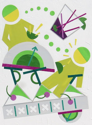
This week I worked on and completed the above piece. The colors are different for me though I consider the selection to be a refinement of some ideas that have guided me for the past year or so. The idea for the piece started out as a sketch about nothing in particular. It morphed itself into these people that appeared, to me at least, to be at the pool, swimming and diving. I named the piece Plunge because when I was a kid, we had a public pool called the Hayward Plunge. We also had a neighborhood pool called Farrelly Pool. The colors reminded me somehow of being a kid and going to the pool:)

Color is such a big component of design. And it's an issue for me. I have been relying on an idea of usage that I see now has been too vague. With the last two pieces though I feel like things are much clearer for me. I looked again at  Joen Wolfrum's color tool. It's designed for quilters but very applicable to artists of all sorts. Based on the Ive's color wheel, it's a 24 step set of color cards that are meant to help you see color relationships and to organize those relationships into meaningful harmonies via the concept of proportion. At least that is how I see the tool's purpose. All these years I think I haven't really understood how to use the cards. It wasn't until recently that I buckled down and applied the concepts. The piece with the Lime Heads was made using the ideas and I think the results were good. It isn't that I am following a formula but that I think I understand better now about the guiding principle of proportion and how to apply that to color. And boy, the colors are gorgeous! I think they are anyway and it's a total surprise to me how the piece turned out. So, those are both good things for me. Maybe I am a step closer to solving some problems.

On another note, I had a very nice email this week from Laurie Fendrich. (Laurie is a New York based artist whose work has really inspired me. If you look at her drawings on her site, your will see right away what I mean.) I reached out to Laurie to thank her for providing such inspiration. It probably sounds stupid that I would do that.  There is so much good content on the web these days though and people think nothing of the images and information that they provide for free. The impact from that sharing can be very meaningful and I think it is important to say thank you; to acknowledge that effort. Most of the time people don't write back. Sometimes they do though and that is gratifying.  Laurie was very gracious and I was happy to hear from her. 

I sure hope everyone had a good week. I am curious to know how anyone reading may use the comments that you get on your own blog. I'd like to know!

Thanks for reading and (hopefully) commenting:)
Libby