 |
| Day 17 |
 |
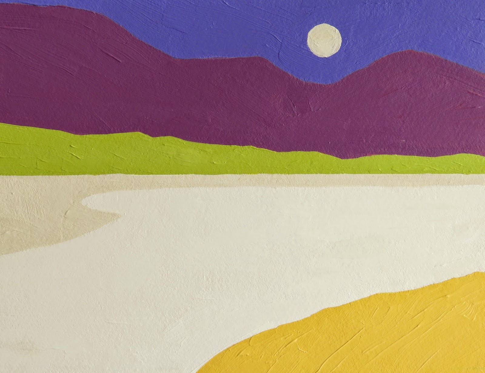
| Day 15 |
The first piece, Day 17, was done today. It was directly inspired by this piece here by Etel Adnan. It's my landscape of Lake Hogan but her coloration choices, mostly. One of the things that I am learning during this challenge has to do with color combinations and my preferences. I have never been a huge fan of violet and yellow together. Or of red-violet and green-yellow for that matter either. I am learning that to my eye, they now seem to work well together. I can see that they can be appealing together. The other thing that I am learning is that there can be a large range of colors that fall into any one category. I came up with any number of shades of violet depending on what paints I mixed and how much white I used. And temperature makes a difference and is directly relative to the other colors in the piece. But it's that latitude of hue for any one selection that makes things so exciting. The yellow I used above is actually pretty warm, bordering on an orangey-yellow. I think of it as golden yellow and I like it with that bluish violet which is really more red than blue to my eye. I could have cooled it down considerably and gotten a totally different feeling.
The second piece is a variation form the piece I did the other day. I kept most of the colors based on an orange-y/yellow and violet blue idea and then added in the warmer to cooler greens as a counterpoint to those main opposites. I punctuated the whole thing with the warmish blue sky and orangey/yellow-y sun/moon.
As I am learning about color, I am also learning how to apply the paint and how to make good incremental decisions as I go along. The initial color and value relationships get put down with gesso and pigment in thinner strokes. If I like the overall idea then I apply another layer of pigment mixed with gesso. If needed, I will do one final adjustment of more pigment and gesso. The point is to get the color, value and saturation relationships right (in my mind) before laying on any thick layer of paint. Working thin to thick in other words. I have also learned to think carefully before applying that thick paint. Direction and stroke length matter. Going back over areas as they dry doesn't always turn out well. The paint is tacky and your brush can drag across it which I find isn't always desirable (for me anyway).
OK, that is it for me. There are other ideas in the works but I need a nap! Thanks for reading and commenting.
Libby
I'm enjoying your use of complementary colors and simple shapes. Very effective.
ReplyDeleteConnie
Connie-
DeleteThanks so much Connie! For the challenge I am trying to explore some different concepts about using color and shape together. Thirteen more days to go!
Thanks for the visit and comments!
Libby
I think this challenge offers the perfect time to explore new concepts. During the September 30 Day Challenge I concentrated solely on alcohol inks which proved to be very interesting and helpful to my current thoughts. It's all about evolving and it's all good!
ReplyDeleteConnie
You are so right about that evolution thing in art making. It really drives the whole process doesn't it?
DeleteLibby
I love how you love the beautiful simplicity of a graceful shape
ReplyDeleteI like Day 17!
ReplyDelete